
Circle of Fortune
Entrant Company
Uni Being LTD.
Category
Packaging Design - New Category: red envelope
Client's Name
Country / Region
Taiwan
The inspiration originates from an acrylic painting created by a talented Executive Chef from Singapore. The designer carries forward the emotional depth and life reflections embedded in the artwork, blending the artist’s confidence in talent and aspiration into a design that inscribes blessings onto the red envelope.
In the painting, the pineapple symbolizes prosperity, the sailing ship represents exploration and progress, and the circular form signifies treasured connections. By integrating these elements with traditional Chinese auspicious patterns, the design transforms the red envelope into more than a cultural object—it becomes a silent bearer of blessings, conveying hope and envisioning a renewed future for the coming year.
The most distinctive aspect of this work lies in its seamless fusion of traditional Chinese auspicious motifs with Western abstract art, creating a contemporary visual language through vibrant colors and expressive lines.
The series includes three themes: “Prosperity (Wang Lai),” “Setting Sail,” and “Circle · Connection.”
“Prosperity” features the pineapple as a symbol of abundance and good fortune, combined with traditional knot patterns representing continuity of blessings and a promising future. The reverse side incorporates the “wealth turtle” and “Hundred Wealth” imagery, symbolizing wealth flowing from all directions.
“Setting Sail” uses imagery of ships, fish, and flowing water to create a dynamic composition, conveying smooth progress in one’s career and extending the auspicious meaning of abundance year after year.
“Circle · Connection” represents meaningful encounters in life through colorful circular forms, enclosed within a gourd shape symbolizing protection, fortune, and completeness.
In form, the design breaks away from the traditional vertical red envelope format, adopting a horizontal opening to symbolize wealth entering from the side. A clasp structure replaces adhesive sealing, suggesting continuous flow of prosperity and adding both functional and symbolic innovation to the design.


Credits
Entrant Company
Ruilin Mao
Category
Conceptual Design - Interaction

Entrant Company
Mianxiuxiu
Category
Product Design - Baby, Kids & Children Products
Entrant Company
Hagel(Shenzhen)Design Co.,LTD
Category
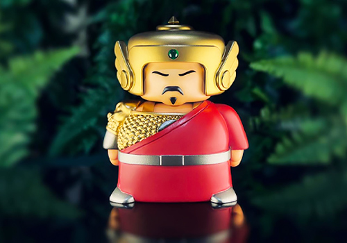
Character & Pop Design - Cultural / Folklore Inspired Characters

Entrant Company
Enping Hsu
Category
Product Design - Sustainable Living / Environmental Preservation